Brexit Poll Analysis

This is an AM01 Applied statitics project undertaken by my study group to analyse the Brexit polls. We have tried to visually study how the political affiliation translated to Brexit voting using the data provided. We have described the GDP components over time for 3 countries (Germany, Indian and United States). The breakdown of GDP at constant 2010 prices in USD has also been analysed and is depicted by plots in this project.
Brexit plot: How political affiliation translated to Brexit voting
Import the data:
brexit_results <- read_csv("https://raw.githubusercontent.com/kostis-christodoulou/am01/master/data/brexit_results.csv")# Concatenated colors in new variable
parties_brexit_names <- c("Conservative", "Labour", "Lib Dems", "UKIP")
colors_brexit <- c("#0087dc", "#d50000","#FDBB30","#EFE600")
# Tidy long format
tidyresults <- brexit_results %>%
select(1:6) %>%
pivot_longer(cols = 2:5,
names_to = "party",
values_to = "percentage")
# Create scatterplot with regression lines
ggplot(tidyresults, aes(x= percentage, y = leave_share, colour = party)) +
geom_point(alpha = 0.3, size = 1)+
geom_smooth(method=lm)+
labs(
title = "How political affiliation translated to Brexit Voting",
y = "Leave % in the 2016 Brexit referendum",
x = "Party % in the UK 2015 general election"
)+
theme_bw()+
ylim(20, 102)+
theme(legend.position="bottom",
legend.title = element_blank())+
theme(text = element_text(size = 7))+
scale_color_manual(values=colors_brexit,
labels=parties_brexit_names)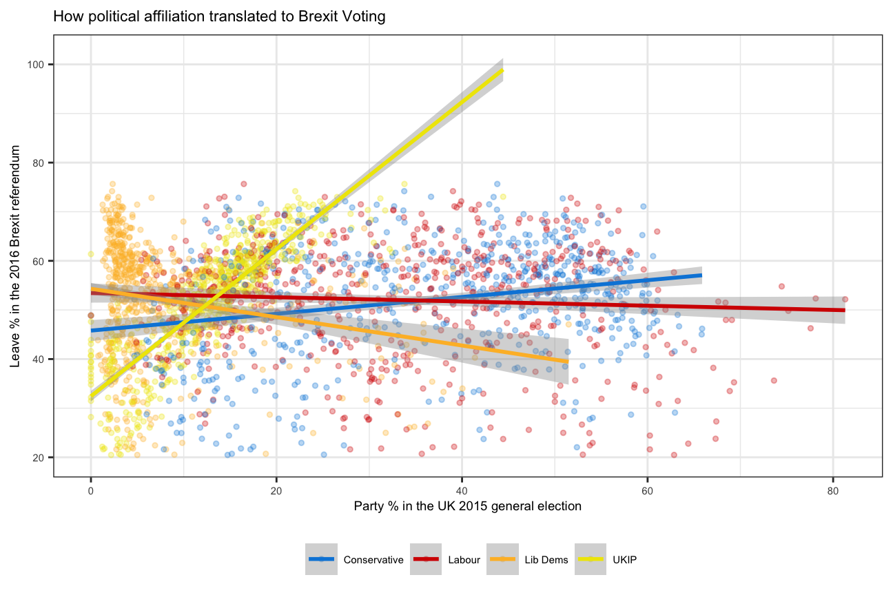
GDP components over time and among countries
UN_GDP_data  <-  read_excel(here::here("data", "Download-GDPconstant-USD-countries.xls"), # Excel filename
                sheet="Download-GDPconstant-USD-countr", # Sheet name
                skip=2) # Number of rows to skip
Tidy the data, use billions for high values and change to shorter variable names.
# Pivot longer + Renaming indicators

tidy_GDP_data  <- UN_GDP_data %>%
                      pivot_longer(cols = 4:51, names_to = "Year") %>%
                      mutate(value=value/(1e9),
                             across('IndicatorName',str_replace,"Exports of goods and services", "Exports"),
                             across('IndicatorName',str_replace,"Imports of goods and services", "Imports"),
                             across('IndicatorName',str_replace,"General government final consumption expenditure", "Government expenditure"),
                             across('IndicatorName',str_replace,"Household consumption expenditure \\(including Non-profit institutions serving households\\)", "Household expenditure"))

# Let us compare GDP components for these 3 countries
country_list <- c("United States","India", "Germany")
indicator_list <- c("Exports","Imports","Government expenditure","Household expenditure","Gross capital formation","Net Exports")
#Creating line chart and setting colors due to different order
tidy_GDP_data %>%
mutate(Year=as.integer(Year)) %>%
filter(Country %in% country_list, IndicatorName %in% indicator_list) %>%
ggplot(aes(Year,value,color=IndicatorName))+
geom_line(size=0.8)+
xlim(1970,2017)+
facet_wrap(~Country)+
labs(title = "GDP components over time",
subtitle = "In Constant 2010 USD",
x=NULL,
y="Billion US$",
color= "Components of GDP")+
#scale_color_discrete(name = "Components of GDP")+
# theme(legend.title = "Components of GDP")+
scale_color_manual(values = c("#A3A500",
"#00BF7D",
"#F8766D",
"#2FBEF7",
"#EA7DF4"))+
theme_bw()+
theme(panel.grid.minor.x = element_blank())+
theme(text = element_text(size = 7))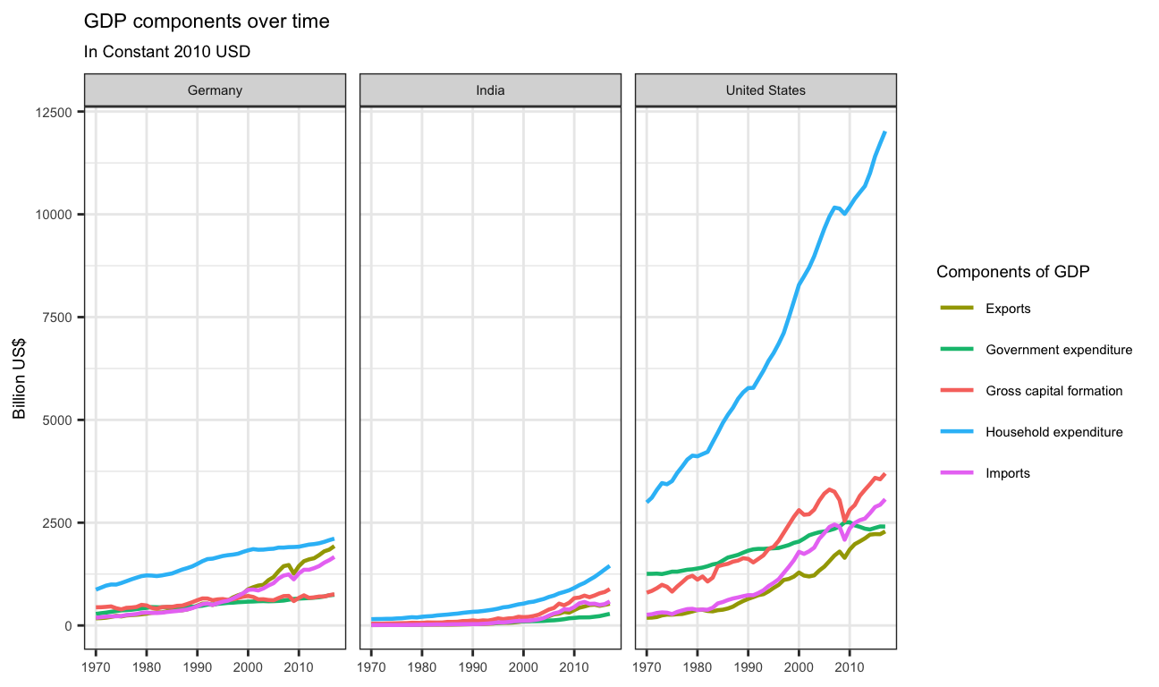
GDP and its breakdown at constant 2010 prices in US Dollars
# Going back to wider to easily calculate columns

tidy_GDP_data %>%
    mutate(Year=as.integer(Year)) %>%
    filter(Country %in% country_list, IndicatorName %in% indicator_list) %>%
    select(Country,IndicatorName,Year,value) %>%
    pivot_wider(names_from = IndicatorName,values_from = value) %>%
    clean_names() %>%
    mutate(net_export=(exports-imports),
           GDP=(household_expenditure+ government_expenditure+gross_capital_formation+net_export),
           "Household expenditure"=household_expenditure/GDP,
           "Government expenditure"=government_expenditure/GDP,
           "Gross capital formation"=gross_capital_formation/GDP,
           "Net Exports"=net_export/GDP)%>%
    pivot_longer(cols=3:13,names_to = "IndicatorName") %>%
    filter(IndicatorName %in% indicator_list) %>%
    ggplot(aes(year,value,color=IndicatorName,group=IndicatorName))+
    geom_line(size=0.8)+
    xlim(1970,2017)+
    facet_wrap(~country)+
    labs(title = "GDP and its breakdown at constant 2010 prices in US Dollars",
       x=NULL,
       y="proportion",
       caption = "Source: United Nations, https://unstats.un.org/unsd/snaama/Downloads")+
     scale_color_discrete(name = NULL)+
    theme_bw() +
    theme(panel.grid.minor.x = element_blank())+
    scale_y_continuous(labels = scales::percent)+
    theme(text = element_text(size = 7))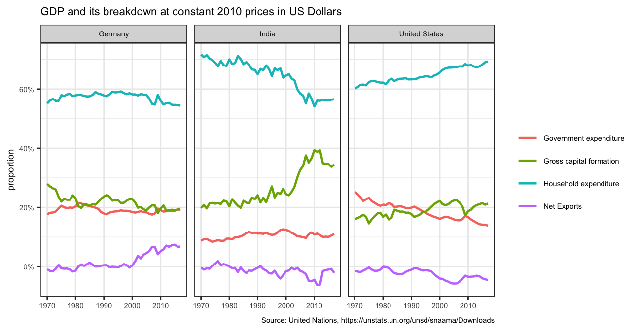
What is this last chart telling you? Can you explain in a couple of paragraphs the different dynamic among these three countries?
The last chart potrays that Household expendiure has been the major contributor to GDP since 1970 in all the three countries, while net exports contributes the least.
While in Germany and the United States Gross Capital Formation and Government Expenditure have been almost overlapping, in India, Gross Capital Formation has been evidently higher than the Government Expenditure.
It is also interesting to note that in India, the proportion of contribution of Household Expenditure has been consistently falling while that of Gross Capital Formation has been increasing.
What is the % difference between what you calculated as GDP and the GDP figure included in the dataframe?
# Add column for self-made GDP and add column for percentage difference

GDP_cal<- tidy_GDP_data %>%
    mutate(Year=as.integer(Year)) %>%
    filter(Country %in% country_list) %>%
    pivot_wider(names_from = IndicatorName,values_from = value) %>%
    clean_names() %>%
    mutate(net_export=(exports-imports),
           GDP=(household_expenditure+ government_expenditure+gross_capital_formation+net_export),
           gdp_difference=(GDP-gross_domestic_product_gdp)/(GDP))

# Plot it

 GDP_cal%>% ggplot(aes(x=year, y=gdp_difference))+
           geom_path()+
          geom_point(size=0.01)+
          facet_wrap(~country)+
          scale_y_continuous(labels = scales::percent)+
          labs(x="Year",
               y="Difference in GDP",
               title = "% difference in given GDP and calculated GDP" )+
          theme_bw()+
          theme(panel.grid.minor.x =element_blank())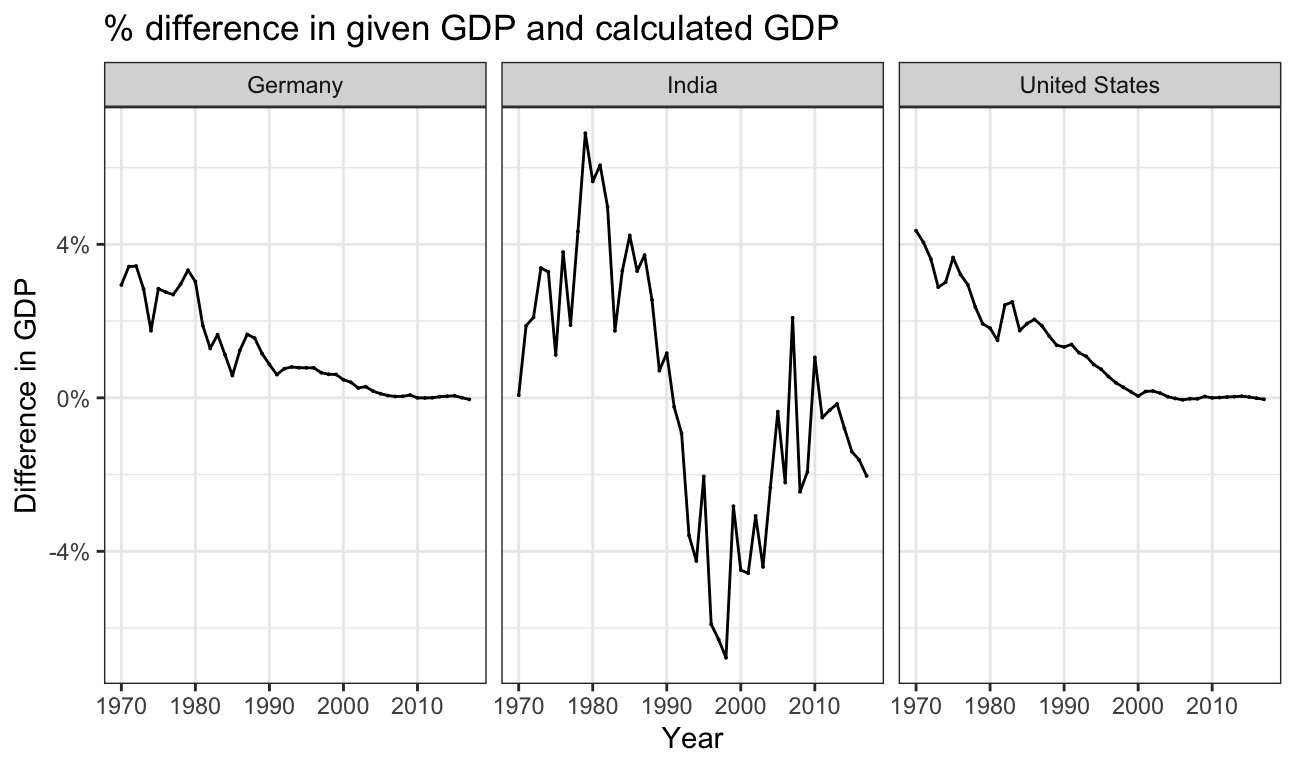
Answer:
It is interesting to note that since 2000, especially for Germany and US the value calculated by formula almost exactly matches the official GDP.