Stock Analysis

This is an AM01 Applied statistics project undertaken by my study group to returns of few financial stocks. We have extracted and plotted the data for companies per sector from the given data set. Monthly summary of returns from each stock is calculated in our analysis. Risk analysis of stocks has been done based on the data provided to understand the risk involved in the stocks under analysis.
Returns of financial stocks
# read data from dataset
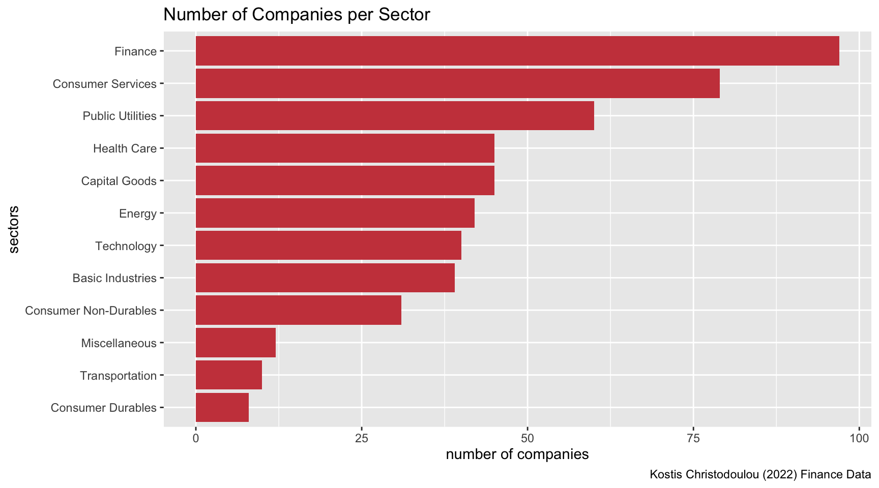
nyse <- read_csv(here::here("data","nyse.csv"))Visualisation of number of companies per sector based on the dataset
nyse_sectors <- nyse %>%
  count(sector, sort=TRUE) %>%
  mutate(sector = fct_reorder(sector, n))

kable(nyse_sectors, caption = "Number of Companies per Sector")| sector | n |
|---|---|
| Finance | 97 |
| Consumer Services | 79 |
| Public Utilities | 60 |
| Capital Goods | 45 |
| Health Care | 45 |
| Energy | 42 |
| Technology | 40 |
| Basic Industries | 39 |
| Consumer Non-Durables | 31 |
| Miscellaneous | 12 |
| Transportation | 10 |
| Consumer Durables | 8 |
ggplot(nyse_sectors, aes(x = n, y = sector)) +
  geom_col(fill = "#CB454A") +
  labs(
    title ="Number of Companies per Sector",
    x="number of companies",
    y="sectors",
    caption = "Kostis Christodoulou (2022) Finance Data"
     )
# Notice the cache=TRUE argument inthe chunk options. Because getting data is time consuming,
# cache=TRUE means that once it downloads data, the chunk will not run again next time you knit your Rmd

myStocks <- c("AAPL", "JPM", "DIS","DPZ","ANF","TSLA","SPY" ) %>%
  tq_get(get  = "stock.prices",
         from = "2011-01-01",
         to   = "2022-08-31") %>%
  group_by(symbol)

glimpse(myStocks) # examine the structure of the resulting data frame
## Rows: 20,545
## Columns: 8
## Groups: symbol [7]
## $ symbol <chr> "AAPL", "AAPL", "AAPL", "AAPL", "AAPL", "AAPL", "AAPL", "AAPL…
## $ date <date> 2011-01-03, 2011-01-04, 2011-01-05, 2011-01-06, 2011-01-07, …
## $ open <dbl> 11.6, 11.9, 11.8, 12.0, 11.9, 12.1, 12.3, 12.3, 12.3, 12.4, 1…
## $ high <dbl> 11.8, 11.9, 11.9, 12.0, 12.0, 12.3, 12.3, 12.3, 12.4, 12.4, 1…
## $ low <dbl> 11.6, 11.7, 11.8, 11.9, 11.9, 12.0, 12.1, 12.2, 12.3, 12.3, 1…
## $ close <dbl> 11.8, 11.8, 11.9, 11.9, 12.0, 12.2, 12.2, 12.3, 12.3, 12.4, 1…
## $ volume <dbl> 445138400, 309080800, 255519600, 300428800, 311931200, 448560…
## $ adjusted <dbl> 10.05, 10.10, 10.18, 10.18, 10.25, 10.44, 10.42, 10.50, 10.54…#calculate daily returns
myStocks_returns_daily <- myStocks %>%
tq_transmute(select = adjusted,
mutate_fun = periodReturn,
period = "daily",
type = "log",
col_rename = "daily_returns",
cols = c(nested.col))
#calculate monthly returns
myStocks_returns_monthly <- myStocks %>%
tq_transmute(select = adjusted,
mutate_fun = periodReturn,
period = "monthly",
type = "arithmetic",
col_rename = "monthly_returns",
cols = c(nested.col))
#calculate yearly returns
myStocks_returns_annual <- myStocks %>%
#group_by(symbol) %>%
tq_transmute(select = adjusted,
mutate_fun = periodReturn,
period = "yearly",
type = "arithmetic",
col_rename = "yearly_returns",
cols = c(nested.col))Summary of monthly returns for each of the stocks and SPY
kable(myStocks_returns_monthly %>%
  group_by(symbol) %>%
summarize(min_return = min(monthly_returns), max_return = max(monthly_returns), median_return = median(monthly_returns), mean_return = mean(monthly_returns), sd_return = sd(monthly_returns)), caption = "Monthly Returns for Stocks")| symbol | min_return | max_return | median_return | mean_return | sd_return |
|---|---|---|---|---|---|
| AAPL | -0.181 | 0.217 | 0.023 | 0.023 | 0.079 |
| ANF | -0.421 | 0.507 | 0.001 | 0.003 | 0.146 |
| DIS | -0.186 | 0.234 | 0.007 | 0.011 | 0.072 |
| DPZ | -0.194 | 0.342 | 0.025 | 0.027 | 0.077 |
| JPM | -0.229 | 0.202 | 0.020 | 0.012 | 0.073 |
| SPY | -0.125 | 0.127 | 0.015 | 0.011 | 0.040 |
| TSLA | -0.224 | 0.811 | 0.012 | 0.050 | 0.177 |
Density plot for all the stocks
ggplot(myStocks_returns_monthly, aes(x=monthly_returns)) +
  geom_density() +
  facet_wrap(~symbol) +
  labs(
    title ="Density plot of monthly returns for each stock",
    x="monthly returns",
    y="density",
    caption = "Kostis Christodoulou (2022) Finance Data"
     )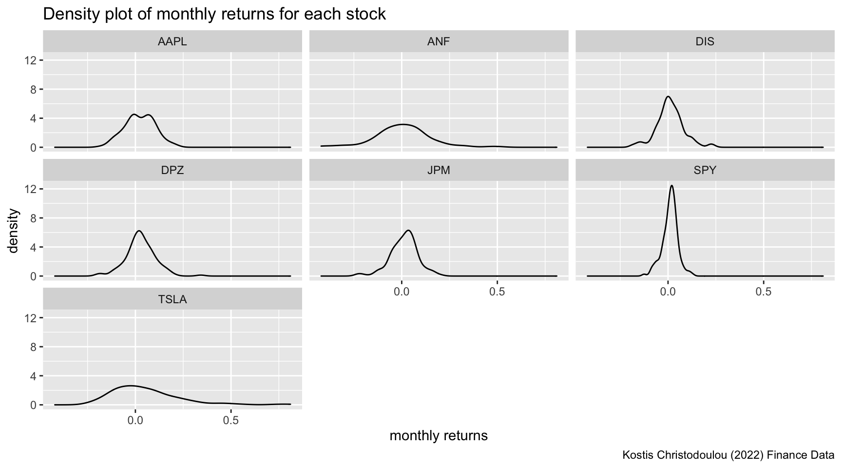
Inference
Analysis of risk involved in the stocks that are analysed
This density plot shows the distribution of the companies’ monthly returns. A broad curve with greater spread means that we have a large variance in outcome and thus higher risk. Therefore, it appears that Tesla is the riskiest asset in our portfolio as it has a very large spread of monthly returns and the maximum density of a possible return value is below 3. As a tech company, Tesla faces great business uncertainties (e.g. technologicla breakthroughs). SP500 ETF is the least risky one, as a “spike” is shown in the diagram, its monthly returns are very concentrated, reaching the density above 12. Meanwhile its spread is very narrow. This is because the stock is an index ETF which is made up by the selected index stocks in the market and generally reflects the risk of the entire stock market across multiple industries which diversifies the risk.
Visual depiction of expected monthly return (mean) of a stock and the risk (standard deviation) all each stock
mean_sd_return <- myStocks_returns_monthly %>%
  group_by(symbol) %>%
  summarize(mean_return = mean(monthly_returns), sd_return = sd(monthly_returns))

ggplot(mean_sd_return, aes(x=sd_return, y = mean_return, label=symbol))+
  geom_point(shape=23, fill="black") +
  geom_text_repel(fontface = "bold") +
  labs(
    title = "return vs risk of stocks",
    x="standard deviation of monthly return",
    y="mean of monthly return",
    caption = "Kostis Christodoulou (2022) Finance Data"
) 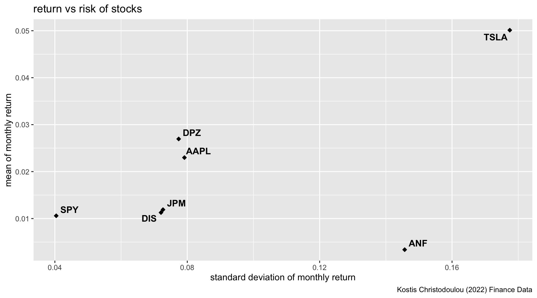
What can you infer from this plot? Are there any stocks which, while being riskier, do not have a higher expected return?
Answer: Standard deviation can be used to show the volatility of the stocks, and therefore the risks beared by the investors. Most companies’ stocks follow the rule of “risk vs return”, which means that those with higher risks should generate higher returns to compensate. For examples, S&P 500 ETF generates less risk for less return whearas Tesla generates extremely high return for high risk. Other stocks similarly follow this rule. However, Abercrombie & Fitch is risky but still provides low returns. This poor performance aligns with the bad news on the company over the recent years, including the declining sales from 2020 to 2022, scandals of discriminatory hiring practices, store closure etc.